Friday, May 24, 2013

My Blog Is Moving!

After just four, brief months on Blogger, I've decided to pack up my internet bags and move everything to a sexy new website.  From now on, you can get a peek inside my head and sketchbook by visiting laurilew.is.


Fun fact: laurilew.is cost ten times more than laurilewis.com.  Domain hacks are like the vanity license plates of the interwebs.

The new site will be under construction for a bit, so please forgive any clunkiness or weird placeholder text.  I remembered I was lazy while making my student website and described myself as 'Queen of the Ring Tailed Lemurs'.  That has been my 'About' section for two years.

Friday, May 17, 2013

Butterfly Kisses

I just finished a fun gig doing logo illustration for Butterfly Kissed Lashes.  The client knew exactly what she wanted, even down to the shape of the sparkle in the eye.

My first design

The final image

Sunday, May 5, 2013

Making of a Toons On Tap Poster - Session 29: Wizard of Oz

Daytona Bitch returns.  Oh, yes!

Photo courtesy of my favourite photographer, Jeffrey Adam Danyleyko.

For our upcoming Wizard of Oz session, not only will Daytona strut her heels across our stage again, she will be joined by another drag superstar- the sassy chanteuse Miss Conception!  I'm about to shit kittens in happiness.


The last poster I made of Daytona Bitch I thought did not resemble her strongly enough.  This time, I studied the individual styles of both queens to avoid drawing them as twins.  For example, Daytona draws on her eyebrows higher than her natural brow much like a cartoon villain.  In contrast, Miss Conception looks exactly like Adele, down to the ponytails and sensible shoes.
Daytona studies
For photo reference, I had Jeremy take dozens of photos where I worked out the poster poses myself.  

Channelling my inner drag queen
Unexpectedly, my hard drive crashed after I began the poster in Photoshop, and the file could not be recovered.  Fortunately, because I had gotten used to blogging about my process, I had a low-resolution image saved of my work at that point.  I was grateful for everything I had backed up, and embarrassed about everything I hadn't.


The biggest difficulty I had (other than the hard drive crash), was rendering Miss Conception.  At first she looked out of place and had the colour scheme of an insurance office.


Looking back at the ugly draft, I had planned on her to be monochromatic.  Redoing most of her lines, turning her yellow, and slapping on a gingham print, I got her to fit in better with the green and black witches.

Almost there
After some fiddling with gradient adjustment layers, I was happy with the poster. 

The gradient
The final result
It was pointed out to me that the font I used is from the Nightmare On Elm Street posters.   Oops.  I would mistake a famous, horror typeface for something whimsical.  


Wednesday, May 1, 2013

No More Dirty Dishes (End of the Sketch Challenge)

Midnight.

Minutes into May and the end of the April sketchbook challenge between Jeremy and myself.  I'm stuffing my face with canned beans and feeling bummed that I came this close to completing the challenge, but just fell short.

Rather than blame myself, I'm blaming the structure of the challenge.  Hear me out.

When I have previously set out to draw more, I'd set a single, numerical, daily goal that was easily tracked.  Ex. draw three sketchbook pages a day for 30 days.  Whether progress was being made was reduced to a yes/no question.  Did I draw three pages today?  Y/N?  After a few weeks, I could see patterns of when I did and did not meet the goal and work to make improvements.  Drawing habits were formed and my work got better.

Our April challenge, in contrast, had a laundry list of requirements to be completed.  Once the time was up and the sketchbooks were filled, there was too much room for debate.  As an example, one requirement was 10 pages of creatures.  The page number was an easy benchmark to meet, and could alternately be thought of as 1/8th of the sketchbook or 4 days of the month.  The debate, however, was on what could be considered a creature.  As well, if our creature sketches overlapped with another requirement, such as drawing in marker, did the drawings satisfy both requirements?  Chaos ensued.

So, everyone lost.  Hopefully, we've learned something.

Highlights


Still prepping for an upcoming poster, I studied Daytona Bitch some more.  She must be my muse.


In preparation for a June event, I did oodles of drawings from burlesque videos.  


For caricaturing, I referenced Mugshot of the Day, which is up there with People of Wal-Mart as my new favourite awful corner of the internet.


I did some people watching at one of Toronto Batman's comedy gigs.  One dude was a lawyer who moonlit as a stand-up.  


And of course, I drew at Toons On Tap. 

From Toons On Tap - Session 27: Venom.  Modelled by Jeff Sim.

Lesson Learned


In my previous post about the challenge, I wanted to learn more about how good habits are formed.  The best tool I came across was Charles Duhigg's flowchart that breaks down habits into a three simple parts.  Rather than as an isolated behaviour, habits should be considered as a process.  With the flowchart as a guide, I thought back to my earlier example: why is it easier for me to do the dishes than draw in my sketchbook?

I am cued to dishes whenever I am in my kitchen to do other things.  If I am boiling water, getting a snack, making a meal, putting away groceries -anything, I will probably do dishes as well.  The cue is clearly based on location.  But why?

Last summer, I decided I was sick of my filthy sink and that I would be militant about cleaning it.  My family would wage wars over doing the dishes, so I would have to fight 18 years of bad behaviour.  On a scrap of paper, I wrote 'NO MORE DIRTY DISHES' and placed it above the sink.

The cue
Then, every time I was in the kitchen it was there, too.  3 A.M. and I can't sleep?  Too bad - no more dirty dishes.  After months of being cued by the paper, I stopped noticing it was there altogether and would go through with the behaviour anyways.  Later, I started keeping rags and all purpose cleaner beside the sink to wipe off the counters after the dishes were done.  The 'routine' part of the three step process has been extended; by developing one good habit, I could piggyback on another.  Lastly, I suspect the 'reward' is the nice, fruity smell of my clean sink.  I think this good behaviour would instantly fall apart if I switched to unscented detergent.  Seriously.

Reflecting on this, I don't really want sketchbook keeping to be a challenge.  I want it to be on AUTO-PILOT.  

Monday, April 22, 2013

Mars Needs Pasties

My mother, a farm girl born in the mid-50s, loved going to the drive in.  Since my sister and I were little, my mother has shared that love with us.  We grew up on films like Forbidden Planet, Day of the Triffids, Them!, and Creature from the Black Lagoon.  Although I ended up being far more interested in horror, I'm sure my mother's passion for low budget sci-fi must be buried in my DNA.  I still have my ragged, 20¢ copy of The Encyclopedia of Monsters tucked away on my bookshelf.  I'll be dusting it off in preparation for the long overdue B-movie session of Toons On Tap.

Moreover, days before completing the AniJamRed Herring enlisted Jeremy and I's help on a poster.  For the fourth year in a row, Red will produce her massive nerdy burlesque show Babes In Space.  For the event poster, she wanted to place photos of her performers in an illustrated space landscape.  The deadline- the same as our event poster for Toons.  It was synchronicity.

Toons On Tap - Session 28: Life On Mars


Last October, the team and I had a zombie themed session of Toons On Tap that unfortunately hit the same day Hurricane Sandy did.  Goodbye, grocery money.

Meredith Viner (left) and Nic Farber at Toons On Tap - Session 16: Chicks With Chainsaws.  Photography courtesy of Jeffrey Adam Danyleyko.
The silver lining of the evening was that the models, Nic and Meredith, gave a very strong and expressive performance.   I knew we needed them back, and we needed them back together.

For the upcoming retro space session, Nic will play the brave space commander who encounters the hostile martian Meredith.  It will be silver go go boots, David Bowie songs, and badly positioned boom mikes all the way.  The poster, Jeremy and I decided, should be a cartoony take on movie posters like Barbarella.

Jeremy began by drawing the layout for this and the Babes in Space poster on paper.  In Photoshop, I rendered the image mainly by selecting sections with the pen tool an polygonal lasso tool, then painting the selections with a textured brush.  To create an aged look, I used steps 13, 24, and 25 from this tutorial.  In particular, the empty scanner hack is brilliant and will likely have me scanning a buttload of filthy things.

The process

The fonts used are Rollergirls and Helvetica Neue Bold.  I didn't care for the hearts above the 'I's in Rollergirls, but I did leave one heart above the 'i' in 'drawing'.  Gesture drawing can always use a little love.

The final poster, for web

Red Herring Productions presents Babes in Space


The previous productions of Babes In Space had a Star Wars vs Star Trek theme.  Red Herring is a major contender in the nerdy-burly scene, and this annual show is her flagship.


Unlike the previous poster, this image I rendered mainly by painting with a soft, textured brush on a low opacity.  Jeremy's layouts may have existed in the same world, but we didn't want the outcome of both images to be too similar.

The process

The most useful thing I learned from making the space posters was using gradient map adjustment layers in Photoshop.  Previously, I would attempt to get the same result by creating a gradient in a new layer and setting the layer style to multiply.  The effect isn't even close.

Forgive me, Jeffrey, for butchering your photo.

Maybe everyone else knew about this, but existence of adjustment layers is blowing my mind.  For me, Photoshop feels like a whole universe to explore.

Robo-pasties!

Sunday, April 14, 2013

Halfway Through the Challenge


The halfway point of the April Sketchbook Challenge between Jeremy and myself is one day away.   As I type, Jeremy spontaneously decided to do an all night Caricature-a-thon where he draws any of his Facebook friends who ask.  Good move, sir.

At the start of the challenge, Jeremy found it very intimidating to start drawing on the paper.  I know the feeling.  My first reaction to the 9'' by 12'' coloured paper was to fill it with squirrels.

Squirrels make everything less intimidating
After months of neglecting it, I tried people watching.  I'm embarrassed by how rusty I've gotten.  Although, thinking of my old sketchbooks, my crap drawings to decent drawings ratio is probably the same.

The least worst of the bunch
With lots of Toons On Tap posters to work on, I've been studying the models and costumes of upcoming sessions.  At the start of the month, we had a Lady Gaga session with Daytona Bitch planned for May.  Jeremy insisted we upgrade it to a Wizard of Oz theme.  Click your heels, ladies and gentlemen - there's a new queen coming to Toons.

R.I.P. Lady Gaga session
Some drag queen studies
My favourite subjects to draw are the ladies of Sex and the City, the Real Housewives, and People of Walmart.  I'm probably a horrible person.


Sometimes I worry I'll forget how to draw a face without being goofy.  I drew some Hammer vixens from Jeremy's bookshelf, just to be sure.

Jeremy has many, many books of lady pictures
And of course, I drew at Tuesday's Toons On Tap.


What I have discovered from doing the challenge is that I can develop small habits if by doing so I am procrastinating on bigger habits.  For example, if I want to keep my kitchen sink clear of dirty dishes, but also draw every day, my sink is going to be spotless.  

Another, smaller, discovery I made is that drawing on yellow paper is fun while drawing on red paper is as fun as a migraine.  I had no idea I would hate drawing on red paper that much.

In the rest of the month, I'll try the action film studies idea from Ctrl+Paint in addition to some much needed people watching.  More importantly, I'd like to research habit development and find out why I'll do the dishes at the expense of more important projects.  I don't need a clean sink.  I need a full sketchbook.

Friday, April 12, 2013

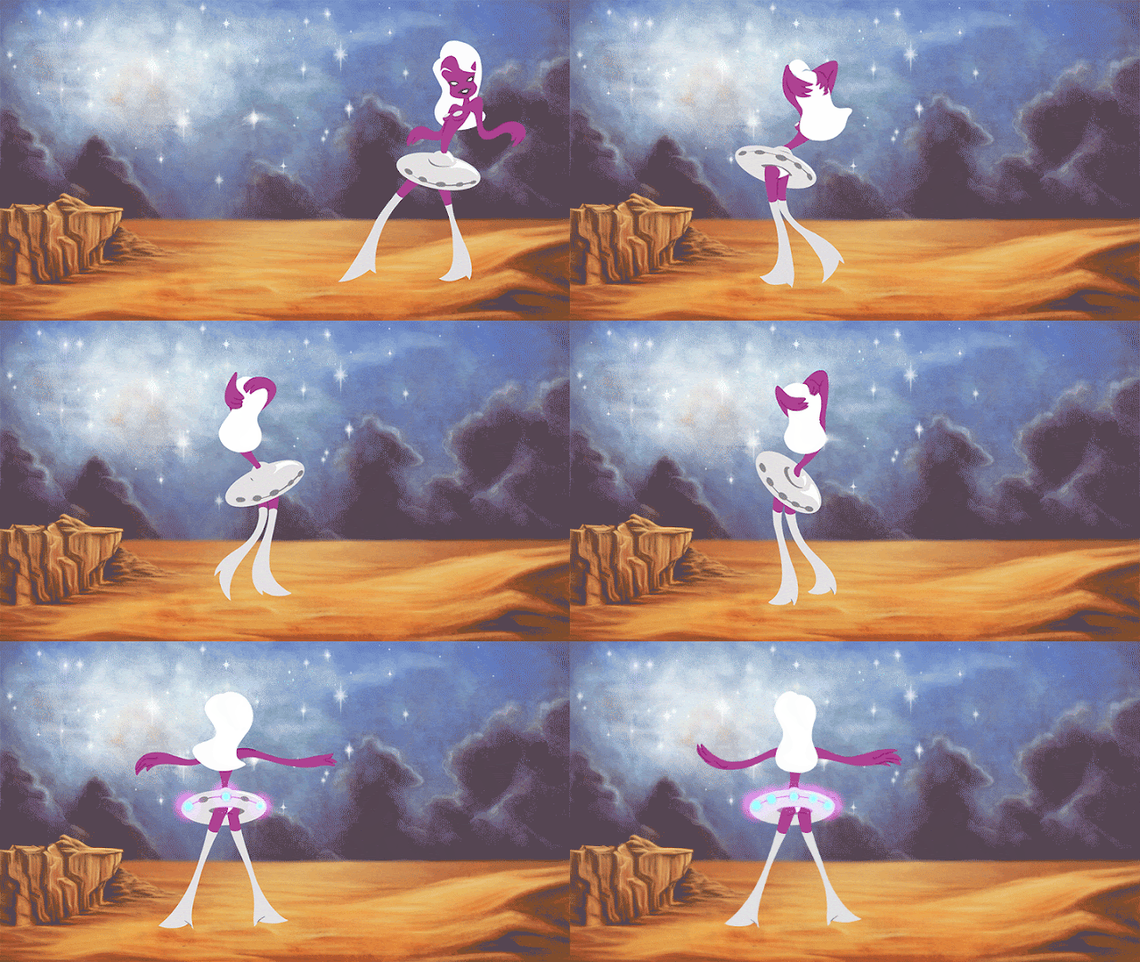
Topless Spacegirl Shakes Hips Or My TAIS AniJam Entry

I finished my entry for TAIS AniJam 2013 today.  After seeing the same 10 seconds on an infinite loop for the past few days, it feels good to be done.


Part one of the process here.

Monday, April 1, 2013

Toons On Tap Gets a New Look

The good news: the organizers behind TAAFI wanted a copy of the Toons On Tap logo for their website.  The bad news: this was our current logo.

Featured on one poster and never used since.
With a good reason for a redesign, I headed to the nearest library to borrow The Big Book of Logos 4.  Browsing through the massive collection, I scanned and collected my favourite designs.  A common theme was forming.

From The Big Book of Logos 4.
I was drawn to clean, geometric designs - especially circles.  The text was either all in uppercase or all in lowercase - no capitalization.  To my surprise, I was really liking bright orange.  Notably, I preferred logos that hinted at the company name through their design.  In particular, I liked the suggestion of a cockroach in the orange R-shaped Roach logo.  

Before moving forward, I asked Jeremy which of my favourites he liked as well.  In his opinion, the strongest design was for Norman Design Studio.  His reasoning: the simple symmetry.  Then, I proceeded to make a vomit dump of ideas in Photoshop.
I must have been craving Tim Horton's
Jeremy gently informed me that all but one were irredeemably horrible.  The only idea he liked was the bulldog clip and blue circle design with lowercase Helvetica Neue Ultralight.  However, we would need to change the graphic.

We brainstormed images that could represent Toons On Tap.  Shot glasses.  Sketchbooks.  Maybe even  a gesture drawing.  Yet, the simplest idea of ours was the strongest: a blank sheet of animation paper.  Life drawing for animators, implied by a white rectangle with Acme punched holes.


Then, I got an idea.  We could continue with the circle design to create personalized business cards for the team.  I made three simple images to represent Jeremy, Jeffrey, and myself.  Jeremy was best summed up by his ball cap, v-neck sweaters, and cheery personality.  Jeffrey, in contrast, is all long hair, t-shirts, and snarky eyebrows.  For myself, I included my ridiculous fake eyelashes and bleach blond hair. 


Going forward, I would like to try two ideas with our new logo.  First, we could create animated cycles within the circle for a logo in motion.  Second, cryptic 'teaser' images could be used to announce upcoming sessions.  The hours I've wasted playing Icon Pop Quiz are seeping into my brain.

Guess the theme

Sunday, March 31, 2013

Sketchbook Guilt

Today is the first of April, and I have two things planned.  First, the Toons On Tap social media accounts will be updated with useless 'art tips' overlaid on a stock photo of a nude, flute playing cherub.  Second, today is the start of a month long art battle between Jeremy Cardarelli and myself.

Poetry
Lately, I have been feeling guilty that my sketching habits have withered since leaving school.  I suspect this 'sketchbook guilt' is not only common, but part of the reason Toons On Tap can exist.

Once, I wrote this in a promotional email:
You need to draw.  I need to draw.  Kevin the ginger computer programmer on Yonge Street needs to draw.  Everyone doesn't draw nearly enough and we all know it.
And got this response:
Best shameless self promotion e-mail I've ever gotten. I'm in T.O, and I will definitely be there monday night. See you then!
Any lessons I glean from getting my own self to draw I can apply to getting more people out to the events.

Sketches from Toons On Tap - Session 25: Cleopatra.  Modelled by Coco Framboise.
Inspiration struck last week as Jeremy and I were browsing an art supply store.  We came across an enticing, multicoloured pad of art paper.  We exchanged looks.  "April Sketch Challenge?"  "Hells yeah!"  Fist bump.  Bought two copies.


Back in September, we completed a similar challenge with positive results.  We've designed the challenge to motivate both of us to draw while playing to the very different ways that we feel motivated.  Jeremy works best when he sets fun, daily goals for himself, clearly and carefully scheduled.  (Perfect example: his Satellite Soda drawings.)  He's an intrinsically motivated fellow who works each day towards his personal best.

As for myself, I'm mainly motivated extrinsically.  Example: the only reason I studied advanced functions in high school was because my potato-head friend once whined that the class was too hard. Honestly, I know I won't magically bounce out of bed and start pumping out sketchbooks 'for myself'.   Jeremy may need the structure, but I need a worthy competitor.


Here are the rules we agreed upon:
  • Fill all pages of the sketchbook, cover to cover, between April 1st and April 30th.
  • Draw on both sides of the paper.  
  • No copying work from other artists.
  • Don't be lazy; the point is to improve.
  • At least 10 pages must be of superheroes.
  • At least 10 pages must be of creatures.
  • At least 10 pages must use coloured markers.
  • Do at least five pages of nude studies, from life.  Draw your friends.  ;) 
  • Draw at least one piece from an exaggerated perspective angle ex. bird's eye or worm's eye.
  • Draw at least three different body types and three different ethnicities.  
If Jeremy completes the challenge, I will take him out to the movies at the end of the month.  If I complete the challenge, Jeremy will buy me yoga pants.  (I wonder why?)  If neither of us can meet the deadline, no prizes for anyone.

I am writing about the challenge here not just to be held accountable by both my blog readers, but to announce my intent to annihilate Jeremy in the competition.  Have fun painting happy little clouds, babe.  I will crush you.


The anthem of my victory

Saturday, March 23, 2013

Making of a Toons On Tap Poster - Session 27: Venom

The team and I have our long list of dream themes we aren't yet sure how to pull off.  We've been dying to do a buddy cop night for months.   I'm insisting on an American Psycho inspired Hallowe'en special.  Jeremy has his heart set on working with former child actor Corey Feldman. (Why!?)  Yet, a chat with Mark Boyer of 3B Artistry has led to the realization of one of our dream themes - a drawing session featuring the comic book character Venom.

Bodybuilder and human statue Jeff Sim is on board to be painted by Mark for our upcoming session on April 23rd.  Both Jeremy and I spent countless afternoons as little kids pouring over special effects books.  To say we're happy to see it done live is an understatement.

Mark Boyer applying make up to Sion Irwin-Childs for our Terminator night.   Photo courtesy of  Jeffrey Danyleyko, the badass Toons On Tap photographer.

To begin the poster, I thumbnailed some ideas while chatting on Skype with my friend Anne.  (Sorry Anne!)  I had in mind a profile portrait of Venom, with the poster text contained within the blackness of his suit.


My partner-in-crime looked over my thumbnails, and disliked all the profile sketches.  Unexpectedly, his clear favourite was the open mouthed drawing, second from the top left.  Taking his advice, I roughed out the drawing on paper, and started tinkering away in Photoshop.

The focus, I decided, would be Venom's jagged teeth.  Referencing photos of infected gums, tooth decay, and rabid dogs, I worked away at making his mouth disgusting.  Considering my own bad teeth give me nightmares, working on this actually made me uncomfortable.  One afternoon during the process, I literally returned home from a root canal to paint rotting, abscessed teeth.  Cathartic, maybe?


All the text is done in the font Ghoulish Fright.  I wanted the bold, graphic look of Socket without using Socket for the one billionth time.  To better resemble the logo from Venom comics, I altered a few of the letters in "Toons On Tap".

The final poster, for print
Lastly, I'm using this poster for two tests:

1) The print versions of the poster say, "Like Us On Facebook!".  Before, our posters listed our bare-bones company website acidanimation.com.  However, we have since found our Facebook 'like' page to be our most effective place to promote.  As of writing, our page is just shy of 500 likes.  Once we reach 1000 likes, I'll treat the boys to champagne.

2) This image will be combined with the April 9th session to make a 'double feature'-style poster.  For the first time, both sessions occurring in the same month intentionally share a related theme.  April will be 'Marvel month' at Toons.  If the double feature idea works, we'll promote the October Hallowe'en sessions the same way.

Now, to see how many times I dream of my teeth falling out between today and the 23rd.

UPDATE:  You can see how Jeremy drew two lovely X-Men for the second half of the double feature poster here.